19 July 2016

Know Your Typefaces: ITC Benguiat


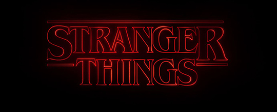
Netflix's Stranger Things firmly displays its retro intentions by using International Typeface Corporation’s Benguiat, a face by Ed Benguiat that was released in 1978. Although obviously inspired by Art Nouveau typography, Benguiat was very much a product of its time and of ITC, with its typically large x-height (the height of a lowercase “x” when compared to a capital) and the bold contrast between thick and thin strokes.

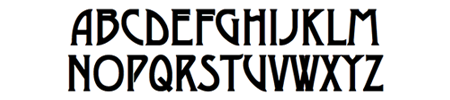
ITC Benguiat Bold (1978)
It’s informative to look at Benguiat in comparison with a well-known Art Nouveau typeface, Desdemona (1886), from which it cribs a few features, including the upward slanting bowls of the P and the R; the high beams of the E, F, and H; and how the slanted beam of the N connects two-thirds of the way down the right stem. But true Nouveau fonts would never have the extreme stroke variation of Benguiat, as they drew their inspiration from vegetal forms.

Desdemona Black (1886)

The bold readability of Benguiat and its wiff of nostalgia made it a particular favorite for paperback designers of the early-to-mid 1980s, where it displaced fussier, swash-serifed and flourish-heavy faces like Tiffany (1974) (also designed by Ed Benguiat). The simple, wedge serifs were well-suited to embossed titles, which were becoming the vogue, especially for genre fiction such as romance, sci-fi, and horror. Bespoke hand-drawn adaptations of the face eventually became the standard setting for Stephen King's name in Signet paperback editions and it's these books that the producers of Stranger Things specifically want to evoke.

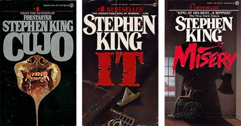
Signet King paperbacks showing letterform variation

While researching Benguiat I was struck by the variation I found in the treatment of King’s name on paperback covers. Before desktop publishing, there was no simple way to manipulate letterforms and designers had to draft logos by hand, particularly if they wanted the letter block set close or to add a flair to a serif or swash. This meant long hours with a set of French curves, and I can actually remember as a baby designer back in the late 80s designing some titles this way. I doubt I still could.


Typefaces by Ed Benguiat
Benguiat had a long career at ITC and was responsible for many of its signature faces.

Horror Books of the 1980s
This collection by Will Erikson shows how ubiquitous Benguiat was (Thanks to Phil Gonzales for the link).

Another blog entry about the same thing
After I wrote this I was pointed to this essay by Ryan Britt on Inverse.

Benguiat is also the typeface for the Smiths' Strangeways Here We Come.

12 May 2016

Give us those nice bright colors, give us the greens of summer


By now you've had a little time to make your peace with the new Instagram icon. In the accelerated, media-savvy world of Internet 2.0 (or whatever release number we're on), there have been already been critical essays on how bad the redesign is (for an example, see this Adweek piece) and a backlash about how old farts just hate change of any sort (for an example, see the comments section of the Adweek piece). Instagram themselves shared a statement about the change, with the usual design-speak explanation that skeuomorphism is old news, that the icon is a doorway into the app and that the app GUI is tailored to the way users use the lightweight photo-manipulation / sharing system.


For me, the rationale is depressingly predictable. In the mobile scene, the clinical eye of Jonny Ive has cast its gaze over everything, and we're told that all users want is an interface that gets out of the way and disappears entirely into a mist of flat gradients and semi-transparencies. Never mind that bright colors and heavily-stroked geometric forms are as invisible as traffic signs—which are, after all, brightly-colored, heavily-stroked geometric forms—in about five years they are going to be as dated as 90s bevels and drop shadows.

But I get that Instagram wants to move on. When it first launched (only four years ago) it was known primarily for its filters, which gave a patina of vintage charm to the most ephemeral of digital productions, the smart phone photograph. Instagram was adopted by the hipsters, who delighted in making their locally-sourced artisanal breakfast sandwich look as though it had been photographed in 1973 by a Poloraid Land camera, or as though that afternoon's thrift-shop find had been kicking around since 1932, as evidenced by the sepia tone of this faux silver print. Of course, everyone hates hipsters, especially hipsters, and Instagram was snapped up by Facebook, which means it's time to move on and embrace a more generic identity.

But what's lost in the rebranding is the sense of play. Social media platforms operate on one level as convenient publishing systems for nonspecialists to share information, but on another level they are games whose rules become defined by their user base. Tumblr is technically a lightweight blog platform, but its character comes from the community drawn to it, whose users have developed a protocol for the correct way to appropriate media and repost it. Snapchat's character arises from the community's interest in intimacy and immediacy. Twitter is where everyone wants to be the most clever. For its brief life, Instagram's quirks (square photos, obvious filters) have combined with urbane hipster tastes to encourage an aesthete's view of the world: photos of alleyways, wrought-iron fences, graffiti on brick walls. No doubt Facebook wants users of all stripes to embrace the application, and your aunt and uncle may have no use for another picture of a manhole cover, but they might consider dropping $40 on a photo book of baby pics.

Still, I had a lot of fondness for the Instagram camera icon. In the iPhone's sea of flat infographics, it was the one hold-out for charm and play. It was sort of oddball, it was sort of ugly. Mostly, it was distinctive, and that loss of distinction is the saddest part. When I was a child, the Holiday Inn "Great Signs" still dotted highways in the midwest. Incongruous and garish, they spoke to the past futurism of the Atomic Age. I remember looking for them on the horizon under the stars during family road trips. They were weird, they were unique. And when at last Holiday Inn decided to replace them, they went for the most bland, most uninteresting alternative. No child would search the night sky for that sign. And no one will pause and smile before tapping the new Instagram icon.


09 March 2016

Man Magazine’s 25 Man-Tasks Every Man Must Do Before He Dies


  1. Butcher one’s own Hartebeest using only a penknife and pocket-comb
  2. Hand-roll the perfect cigar; place in a Lucite case to be smoked upon one’s deathbed
  3. Master the art of single-tear cry
  4. Master the art of removing a front-clasp bra with one's toes
  5. Learn to make the deadliest cocktail, the Dank and Steamy
  6. Serve a Dank and Steamy to Norman Mailer's ghost
  7. Defend a lady friend’s honor by employing a rear naked choke
  8. Learn the difference between a fedora and a trilby
  9. And also a homburg, why not
  10. Spend at least one year’s salary on a bottle of Scotch
  11. Put one's faithful dog of twenty-three years down, but only after staring long into its eyes and reaching an understanding
  12. Write an essay on euthanizing the dog and sell it to the Paris Review
  13. Learn how to say “humidor” in twelve languages
  14. Climb every mountain, ford every stream; but you know, in a manly way, not the way that a nun would
  15. Locate and purchase the car in which you were conceived
  16. Rebuild transmission of said car and present it to your dying father as a gift upon the anniversary of your mother’s death
  17. Sit a while in absolute silence in the passenger seat as your father runs his trembling, spotted hands over the walnut burl dashboard before switching on the radio
  18. Listen to “Reeling in the Years”
  19. Wait, that might be a little too on the nose, let’s make that “My Old School”
  20. Upon the death of your father, drink the bottle of Scotch in a single sitting and crash the car into the first tree you successfully climbed as a child
  21. Fix car and sell on EBay for a profit
  22. Learn to express one’s feelings by not saying or doing anything
  23. Also, no writing anything down, that's cheating
  24. Seriously
  25. One more? Um, read Moby-Dick?

08 March 2016

Final Spoilers, Don't You Know


Mary: Deah Mathyew, I hev so enjoyed our supernatural meetings these strange nights, but somehow I feel we must draw the curtain on these séances, as it were. It’s only that yew hev shuffled off this mortal coil some four yeahs ago, and in the meantime I went and married a motorist—I believe his name is Henry or Heathcliff or something of the sort—in any case I hev also had my dalliances with Gilly and Tony—what I’m sayin’, Mathyew, is I hev had a fair amount of tail in your absence, and perhaps the time has come for us both to move on.

Matt: Oh Mary, yew old thing, I know all about it; For hev I not watched over yew these many nights, creepin’ in through the wainscoting and such, peepin’ in as yew—

Mary: Steady on, Mathyew, can’t a widow hev a bit of privacy?

Matt: Mary, old bean, we on this side of the spiritual veil are not full of your hang-ups, man. As for me, I hev been dallyin' with your dear sister Sybbie on the reg—

Mary: Good Golly! [blushes becomingly]

Matt: —and yet there is something to what yew say, for I too feel we hev arrived at an ending, don’t yew know, and after so many Sunday evenings together we shall need to find something else to do.

Mary: I suppose I felt it when Edith [spits] announced her engagement. Suddenly it seems everyone was getting married: our cranky butler and that Scotswoman, the mousey cook and the strapping young footman [pauses to imagine Andrew in his undershirt] and even your unlovable old mater has found connubial bliss, as it were. Why I do believe our little George has proposed an engagement to Sybbie junior, and he cannot yet pronounce his R’s. It seems as though good times hev come to us all, and all is well as ends well, wot? I suppose I shall switch to watching Poldark [pauses to imagine a shirtless Aiden Turner].

Matt: Well then Mary, I must bid yew and your eyebrows adieu! Only one thing left to say, and, well, I hate to mention it—

Mary: What, my phantasmal lover?

Matt: Only now that Edith is a marchioness, she can, in fact, hev yew beheaded.

Mary: Feets don’t fail me now!


17 February 2016

DPI ain't nothing but a number


In the glamorous world of Web Design, 95% of time with clients is spent discussing the same two or three basic points about image size, so I've attempted to write up a short set of answers to which I could point them. I have tried to be brief and funny, but also useful. I've also tried to keep my tone free from the exasperation I often feel when going over these points for the third time in a day. Graphic designers out there, tell me what points I've missed and where I could be clearer. If you want to use this as a reference in your own correspondence please do.


How big should my image be?


Short answer: 1000 pixels on its longer side. PNG or possibly JPG and less than 1 MB file size. Long answer: see below.

Why is this image "too small?" It's 300 dpi!


In print, the magic standard is 300 dpi, meaning that an image has three hundred pixels per inch at the size it will be reproduced. If your image is 300 dpi but only one inch wide, and you want to fill a double-page spread with the image, it will have to be blown up to seventeen inches and all those tiny pixels will be seventeen times as large so now your image is effectively seventeen and a half dpi.

On the web, dpi is meaningless, because you might be looking at an image on your grandma's '95 Gateway or on next year's Apple Watch: you have no idea what size those pixels are. It's more important to think about how many pixels wide and high an image is so that the designer can think of the amount of space in a window it will occupy.
A nominally high-resolution image becomes low-resolution when presented at a different size

Zoom to enhance?


You can't reveal detail that isn't there. An image that is out of focus or noisy will be more out of focus or noisy when blown up. If the image has sharp lines, like the edges of letters, those will degrade. If you have an image of an old newspaper, you will need to capture all the detail you want at the photography/digitization stage. Words are a special case. People notice blurry letters much more than they notice blurry photos. So if you are digitizing anything you want your viewers to read, crank up the resolution on your scanner.

I compressed it! Aren't you proud of me?


There are lots of ways image encoding systems save disk space. Some take advantage of redundancy in the data and don't affect the way an image looks. Some take advantage of the way the human eye works and these can mess with the quality of an image. The biggest offender here is JPEG compression. This system uses a complex mix of math and psychology to trick the eye into seeing more detail than the file contains. But if you compress things too much the image will degrade, becoming jagged or spotty. This is particularly true of images with sharp lines (like text) or flat colors (like cartoons). For these images, PNG is a better format.
While JPEG compression can save disk space, its flaws are particularly evident with hard-edges and flat colors.

What about bit depth?


Bit depth is a measure of how many different hues an image can have. In theory, the more bits, the more discreet colors are available. In practice, people really can't perceive the subtleties after a while. There are those who claim there's a huge difference between 8 bits and 16 bits per channel. Those people are lying and they have too many figurines on their desks.

Is there anything else I should know?


There's a ton of other stuff to know about digital images, from alpha channels to color spaces. Do you need to know these things? Are you a graphic designer? Then the answer is no. Ultimately the most important stuff is not technical. Is it a good photo? Is it in focus? Does it have white whites and black blacks? Is it not too grainy? Is it grainy enough? Do you like it?