19 April 2022

The Ether Monument, Boston Public Gardens

(Now that my personal website is dead, I'm moving this essay here for posterity.—JMc, 2022)

Ether MonumentPassers-by usually don't notice. After all, one monument looks so much like another, especially in the Public Gardens, which is littered with statues, fountains, and plaques. When someone does stop to look at the cluster of red marble columns and granite arches, set in an empty pool bed, they laugh or scratch their heads. "Would you look at that," one elderly woman says to her companion, and reads aloud the inscription: "To commemorate that the inhaling of ether causes insensibility to pain at the Mass. General Hospital in Boston October A.D..." She fumbles with the Roman numerals of the date, laughs with embarrassment.

Today a monument to ether may seem strange, but for those living in the nineteenth century the drug was nothing short of a miracle. "The greatest invention for humanity since the printing press," one contemporary wrote. Imagine having a tooth pulled without Novocain, a tumor removed without general anesthesia, or a leg amputated with only a bullet to bite. Then you can understand why private citizen Thomas Lee paid handsomely ($6,300 for the statuary alone) to publicly commemorate the first etherized operation, which took place in Boston in 1846. On October 16 of that year, dentist Thomas G. Morton electrified an audience of surgeons and medical students in the operating theater of Massachusetts General Hospital when he put a printer, Gilbert Abbot, to sleep. The attending surgeon then removed a tumor from the sleeping patient's neck: no thrashing, no screams, no restraint by assistants. The theater broke into cheers.

Morton hadn't invented ether. The volatile liquid was discovered in the thirteenth century-maybe earlier-and by Victorian times, many middle-class party-goers in Europe and America used the drug recreationally at so-called "ether frolics." Sometimes the giggling, red-eyed revelers were so insensible they struck themselves on tables, chairs, or the floor-opening bloody wounds that went unnoticed until much later. Morton was the first to suggest ether's surgical use, or so he claimed. Shortly after Morton's demonstration at Mass General, another Boston dentist, Charles T. Jackson, claimed that Morton had stolen his discovery. Jackson was so open and persistent in his rancor towards Morton that the public joined the battle on both sides. Eventually, opinion decided in favor of Morton, but as late as 1882 Mark Twain sided with Jackson, proclaiming that the Ether Monument "is made of hardy material, but the lie it tells will outlast it a million years."

Ether LionTwain wasn't being quite fair. Unveiled in 1868, in the full bloom of the controversy, the Ether Monument bears the name of neither dentist; Oliver Wendell Holmes called it a tribute "to ether-or either." Avoiding the issue in typical Bostonian fashion, the granite statue crowning the memorial isn't Morton or Jackson-it's the Good Samaritan. When commissioning the piece, the monument's architects asked young sculptor John Quincy Adams Ward for something that would show relief from suffering "in the rudest way consistent with artistic feeling," and they got what they were looking for. The sculpture was just to the tastes of the conservative Boston elite, and made Ward's career as a public artist.

When you visit the monument, be sure to look for the four reliefs by Ward, hidden under the monument's Gothic arches. The south relief shows an operation under anesthesia; the doctors wear a mix of nineteenth century and classical costume. On the east relief, an angel of mercy descends to relieve a suffering figure. The inscription from the Book of Revelation reads, "Neither shall there be any more pain." Then as now, people worried about the religious implications of medical science, and the relief on the west side also addresses these anxieties. Here, a woman who represents Science Triumphant sits atop a throne of test tubes, burners and distillers, while to the side, a Madonna and Child look on with approval. The inscription from Isaiah tells the viewer that anesthesia is a gift from God: "This also commeth forth/from the Lord of hosts..." Best of all is the horrific Civil War relief on the north side of the monument: A Union field surgeon stands ready to amputate a wounded soldier's leg. But thanks to the wonder of ether, the soldier sleeps on peacefully while the doctor, heroic as Hercules, sets to his grim work.

Top: Ether Monument, south view; Bottom: Detail of south base of monument (author's illustration).

Copyright (c) 1997 John McCoy 

29 October 2020

There are a whole lot of things in this world of ours you haven't started wondering about yet


One summer's day when I was nine or ten I walked into the children's book room of the small public library in my small midwestern town. The children's room was in the oldest part of the library, which used to be a single-family Victorian house, and in spite of renovation the space still felt homey in a way I couldn't express. A shaft of light streamed in through a high window, catching motes of dust and falling on an old wingback chair. There was no one else there—my town had a dearth of readers, at least of my age. On top of a shelf was displayed a copy of James and the Giant Peach; the original edition with the real illustrations by Nancy Ekholm Burkert. This was a book of whose existence I was aware (from lists in Roald Dahl's other books) but which I had never read. I took the book to the chair and leafed through it and for just a moment, Burkert's luminous, gauzy illustrations coupled with the sunbeam and I had a sensation of flight and of being unmoored in time. I was entirely alone, and I sat there, a long while, until my mother came looking for me.

Ever since, I have chased after that emotion, whatever it was. I haven't found it, but I have found other moments as profound and as hard to categorize. When I was a teenager I spent an afternoon walking through snow following rabbit tracks farther and farther out of town. When I hit a stand of trees I looked up to see a flaming sky, more red than I could imagine, as the sun hovered low between branches; it was past dinnertime, and I felt acutely aware of the earth's rotation. There have been other moments.

28 March 2019

Live fast, fight well, and have a beautiful ending.


In spite of being a tiny town surrounded by endless fields of corn and soybeans, Eureka, Illinois used to have a small movie theater, the Woodford, whose Art Deco stylings dated to 1937. It had once been charming (or at least serviceable) enough, seating 400, but the time I knew it in the 70's the theater had become a sad thing, with patches of the original carpeting replaced here and there by linoleum, haphazard electrical conduit tracing the walls like vine, and a semi-functional bathroom the size of phone booth (all my references date me) whose pull-chain toilet had seen the end of tens of thousands of movie-goers. The Woodford Theater had settled to the bottom of the distributional food chain, showing second-run movies three times a week and softcore exploitation films late Friday nights. Within a few years, VCRs would kill the market for both of these services.

In 1980, New World Pictures released Battle Beyond the Stars. Today I know all about Roger Corman and his infamous studio and that this film was conceived as a prestige project for the company, a retelling of The Magnificent Seven with its cowboys in space (there is an actual character in the movie called "Space Cowboy"). It even has a screenplay by indie darling John Sayles. But at the time I was 12 and all I knew was that an article in Starlog was calling this a more adult version of Star Wars and Star Wars was the Best in Life. The movie did star John-Boy from the Waltons, and I did not like that show, but probably he wasn't so important, right?

My brother and I went to see it on "opening" night, which was probably a month or so after it had been in release. The crowd of maybe 60 or so was mostly bored kids who didn't have a license or a car and couldn't make it to Peoria and so were stuck sitting here in the theater's torn, creaking seats. The audiences at the Woodford were always noisy, but for some reason that night the movie was late in starting, and stray pieces of popcorn were already being lobbed in lazy arcs. Twenty minutes past screentime, the house lights were still on. A chant went up: "Lights! Lights!" The lights went down, but still no picture. The audience booed. Then at last the credits began: cheers! But why was there no music? Some ugly murmuring. The first scene, involving the distruction of a peaceful spaceship by a looming alien warcraft played out in complete silence. "Sound! Sound!" went a new chant, but no sound came through the expository sequences, which consisted mostly of a scene of a futuristic city where John-Boy and his compatriots stood around in robes and stared at the invaders' ship. As it became apparent that no dialog would be forthcoming, the audience began to yell questions: "What's going on?" "Why are they standing there?" and "Where's Jim-Bob?" There were also some attempts at dubbing; someone started to sing the Star Wars theme and many people joined in.

About ten minutes into the movie, the sound abruptly came on with a deafening crack of static, and the audience cheered. John-Boy was in a spaceship: a bulbous, sagging thing that looked as if it could use a space bra, flying away from his besieged planet, adjusting some instruments and talking to his ship's computer, which had a sassy woman's voice and calls him "kid"—and then the image froze, followed by the classic bubbling and melting of scorched celluloid, and there was a riot of teens and pre-teens jumping out of their seats and tossing Jolly Ranchers at the projection booth. The lights came up and an usher walked in, half-heartedly held up his hands in a gesture of quieting, and then shrugged and left. The lights went down again and now there was a scene involving a lizard man talking to a captive woman strung up by her hands in some futuristic cell. "What the F--K?" yelled an older kid from the front row and the usher reappeared. "No language. Watch the goddamn movie, he barked.

The plot of Battle Beyond the Stars, such as it is, involves John-Boy's character traveling through space to secure the aid of mercenaries to fight back his planets' invaders, since his home world is aggressively pacifistic, as befits an alien culture based on white robes and large crystals. He meets aliens wearing space-clown makeup who have third eyes, as well as an intergalactic trucker named Space Cowboy, played by Space Robert Vaughn (space slumming it). But most memorably for the crowd reaction, he meets a Space Valkyrie portrayed by Sybil Danning, a warrior in a metal bikini and winged headpiece who lounges reclined in her fighter ship with the camera shot straight up her heaving bosom. When she delivered her lines about the glories of the warrior life in as low a register as she could manage, her chest rose and fell with such force that the audience began to breathe along with her in an imitation of Darth Vader.

In fact, every character had a defining tic or phrase that the audience picked up and responded to. Space Cowboy would mention at every opportunity that he came from Earth and so whenever a scene cut to him someone would shout "from Planet Earth" before Vaughn could. The sound continued to die for minutes at a time and during these moments the crowd yelled out catchphrases, sound effects, and expletives, but the usher did not return. There was no need; the atmosphere had changed from surly and combative to giddy, engaged, and even strangely affectionate. We had long ago given up on the movie as a movie and had moved on to the movie as happening.  To be honest, I dont remember much about the movies second half. I remember people cheering whenever Sybil Danning or Robert Vaughn showed up to chew more scenery; mock-sobbing whenever one of the ragtag group of defenders met a violent end; and jumping out of their seats in delight whenever the sound cut or the film broke, which it did many times. Eventually the film ended and the audience rose to a standing ovation.

In this post- Mystery Science Theater world we are familiar with the joys of bad movies, of Troll 2 and The Room. Battle Beyond the Stars is not a great film, nor do I think that it's hilariously awful—it's just a hack job from a time when there was a theatrical market for knockoffs of other, better movies. I wouldn't recommend watching it today on DVD or YouTube, even ironically. But that experience, in that sad little broken-down movie house was one of the most joyful I have known. 

Within three years the Woodford closed. Today the building is a Hallmark store. 

26 November 2018

That's Why They Call you Rubberhead

You may not have noticed, but over Thanksgiving there were a lot of online sales. One of these led me to notice a new compilation of old Casper comics from the improbably named publisher American Mythology, whose business model appears to be licensing properties from your childhood, assuming you're 50 years old or more. Since I read a metric ton of Harvey Comics when I was a child, and since I have largely forgotten about them since I was ten, and since it was on sale for Black Friday BUY NOW, I bought it.


In ye olden days, comics were sold in groceries, pharmacies, and even hardware stores as point-of-purchase impulse buys to keep the kids amused. This was the age of the Hey Kids, Comics! wire display, and in addition to Marvel and D.C. there were Archie, Harvey, Gold Key, Charlton, and probably others who came and went in the mix. The advent of a direct market for comics—e.g., comics / ephemera shops and dedicated sections in bookstores, was a bonanza for superhero publishers and a boon for the indie publishers I fell in love with, but it spelled the end for many publishers of kids' stuff. Only Archie survived, and mostly through its digest-sized books that fit comfortably in grocery checkouts between copies of Prevention.

Harvey Comics was very much a creature of its time, founded upon licensed characters, drawing into its fold properties as disparate as the slinky 1940's spy heroine Black Cat (not to be confused with Black Cat) and the WWII humor-in-uniform comic Sad Sack, along with Casper, who was already famous for his Paramount cartoon series before becoming the flagship title for Harvey. Eventually the character of Richie Rich would be originated for the company by cartoonist Warren Kremer, whose bulbous forms and supple ink lines defined the Harvey "look," although sadly he was uncredited in the comics, as was the policy for most companies at the time. It gives me pause to think of the nameless artists who passed through Harvey, required to sublimate their styles into Kremer's. A few would gain recognition—such as the remarkable Ernie Colón, whose career spanned from Richie Rich to Eerie to Battlestar Galactica to "adult" comics for Epic Illustrated.

The table of contents for this collection credits Kremer and Howie Post for the stories, although I suspect that there were other hands involved in some of the pieces. It would be nice to have a listing of the original publication dates and titles, but this is definitely a no-corners-uncut production. The art seems to have been scanned from printed comics, with all the smudgy lines and splotchy Ben-Day dots on proud display, then had its whites blown out and its colors saturated in Photoshop. From the style and printing quality these stories appear to be from the 60s and/or 70s. While the academic in me is disappointed, in an odd way this presentation is true to its source material: Harvey would often reprint and repackage segments, never giving credit, and since the stories were entirely stand-alone and the style was homogenous, and they were for kids anyway, who cares?


This is a long way to go to say that when I actually read the stories I was not prepared for how weird and confusing they would be. For the uninitiated, Casper is a Good Little ghost, which means he is nice in vague ways to the forest creatures he hangs out with. However, ghost culture seems entirely based upon scaring humans by yelling "boo!" at them, a pastime Casper wants no part of. For no good reason, he hangs around with a group of mean ghosts called the Ghostly Trio and tries to convince them of the error of their ways. It's unclear what's at stake for any of these characters: Casper's philanthropy never extends to actually effecting change in his bucolic world. The other ghosts laugh with delight at startling people and animals but they don't seem broken up when foiled in their attempts. In the absence of plot, Casper floats (sometimes literally) from one scene to the next. Sometimes there are gags, sometimes there aren't. In one three-part story Casper tries to find another ghost who shares his milquetoast sensibilities. His cousin, Rubberhead, appears for no particular reason. Casper is happy that two share a resemblance but then Rubberhead uses his "power" (the ability to enlarge his head) (?) to scare a bouquet of flowers. One might think being picked would be enough to terrorize them—not to mention kill them—but it's the head trick that makes them shriek (?).  Throughout these stories, the only thing resembling motivation is the "bad" ghosts' desire to scare; Casper, his pal Wendy, and everyone else seem content to wander from panel to panel, devoid of purpose or reflection. In general, the Harvey characters were defined by a single personality trait, with Casper being "good" and Richie being "rich" and Little Dot being "obsessed with dots." This one-track characterization would eventually be brilliantly satirized by Dan Clowes in his story "Playful Obsession" (Eightball #5, 1992).


One story stuck out to me for its metatextuality. In this story, Casper and his bear cub companion become aware that they are being drawn in a comic by the artist Pete Pencil, who expresses distaste for having to draw comics the way "Harvey" wants them drawn. In this story, Harvey is presented as an avuncular bespectacled man who hangs with forest creatures in his spare time, and he is summoned by Casper to re-assert order. But my heart goes out to Pete, who I can't help but see as a stand-in for all the frustrated artists being paid a pittance to draw in the house style. Many cartoonists of the postwar era were immigrants or from immigrant families, and artists had to take whatever terms they were given.

There is stuff from childhood that can be revisited fruitfully as an adult, augmented by years of experience and sophistication: the books of E.B. White or Laura Ingalls Wilder, for a couple of obvious examples. Then there are those things (such as these comics) that upon examination are far less than what you remembered them being. They are the stories and characters that happened to be available when you were six, whose worlds and lore were magnified by your youthful enthusiasm. Harvey Comics were, in one sense, pretty terrible. But that doesn't mean they can't be read with enjoyment today. They offer a glimpse into a world of journeyman artists churning out gags for an audience of children not yet served by electronic media. They are also, as the Firesign Theatre would say, weird with a beard.

19 November 2018

And Other Tales

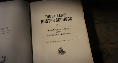
The new Coen Brothers film The Ballad of Buster Scruggs features an impressive cast, but for me the true star of this anthology is the prop book used to join these violent, nihilistic western stories together.


The book is presented as cloth-bound with an embossed cover. Cloth binding was developed in the 1820s and by the 1830s embossing was developed, leading to increasingly ornate treatments and eventually to foil-stamping, The understated, two-color printing marks this as a humbler work for a popular audience. I can't place the typeface, but it looks quite a bit like Weiss (1928), which in turn was based on Italian Renaissance printer's faces. The bold, simple design of the cover illustration brings to mind book designs from the 1910's and 1920's, which was also a popular time for western literature, which had its major flowering of popularity with the publication of Owen Wister's The Virginian (1902).


Which makes it a bit surprising that the front matter dates the book to September, 1873. The decision seems to have been to want to locate the fictional book closer to the events it depicts, which seem to be in the 1840s (particularly in reference to the Gold Rush and the Oregon Trail). But there are many details to the book which would make it an artifact of the turn of the century or even later. The barred "western" typeface used for the title here appears to be Barbaro Roman, a contemporary face mimicking Victorian sources. The type shows a slight embossing, which is the sign of letterpress, or movable type. But overall the title page "feels" contemporary rather than historic. The leading (space between lines of text) is much tighter than a 19th century source would be. The text is sized subtly as in the slightly smaller "THE BALLAD OF" and the slightly larger "BUSTER SCRUGGS"; an actual 19th century printer would not have such a collection of font sizes in metal, particularly for a display face.


The color plates are the perhaps the most remarkable feature of the prop. Color lithography had been used to decorate letterpress books since the late 18th century, but it became more popular in the late 19th. These images had to be printed separately and were much more fragile than the letterpress pages, and so required protective sheets of onionskin or glassine to keep the ink from rubbing off. The illustrations in the prop book evoke the Brandywine School of illustration, named after the artists' colony founded by Howard Pyle in 1895. It was to this school that illustrator N.C. Wyeth belonged, whose famous illustrations for Treasure Island (1911) and The Boy's King Arthur (1922) set the tone for lush illustrations of adventure for decades to come. It's these illustrations that would lead me to guess the book was a product of the 1910's or the 1920's if we were not given a "copyright."


Even more anachronistic are the illustrated endpapers, rendered in a watercolor style that strikes me as more 1950's or even 1960's. But I don't know as much about the history of these. Perhaps a reader of this essay with more information than I have could chime in with their assessment?


Finally, I have nothing historical to say about the book's dedication, except that I'm sure there's a story here somewhere.

20 June 2018

Borderlines are personal

There are frustrating things about living in a politically heterogeneous country. There are policies I would dearly like to see implemented that I know are opposed by many, perhaps a majority of Americans. I'd love to see free higher education for all, universal healthcare. I'll even admit that I'd be happy to see a repeal of the second amendment. There are many things I'd do to sway opinion, or ways I'd politically maneuver, or even leverage technicalities in our system, to change this country in ways that I believe it could be better. 
So I get that people have deeply held beliefs that are opposed to mine, and I understand when they are motivated by those beliefs to employ a variety of strategies that will achieve their goals. That's democracy. But there's a line. 
You may think we have borders that are too porous, or that our culture is being diluted by other cultures, or that our economy can't sustain the influx of refugees, or that those refugees include dangerous criminals, or a million other things. You might vote or lobby to enact policies that make immigration to the United States difficult or impossible. You might exploit irregularities in our legal and political systems. But will you tear families apart to get what you want? Will you traumatize children for life? Will you expose babies and toddlers to the threats of excessive heat, disease, abuse, disappearance? Because you want to feel safer? 
And how safe do you need to feel, and how many children will you sacrifice to feel that way?

10 January 2017

Know Your Typefaces: Optima


On my office wall I have a framed type specimen that comes from a silkscreened portfolio of typefaces offered by the Stemple Foundry which I found discarded in a dumpster behind my apartment back in 1993. The previous owner had also thrown out a copy of the classic of pre-digital typography, Designing With Type; I can only assume that whomever had thrown them out did so in a fit of pique regarding the then-nascent desktop publishing revolution. Whatever the reason, these beautiful, oversized sheets have become a treasured possession of mine, and especially the one framed on my wall, of Hermann Zapf's 1955 Optima, my favorite typeface.

My framed specimen. In German, "Antiqua" is used as "Roman" is used in English when referring to a typeface.
Zapf turned to type design after working through World War II as a calligrapher, and his work is marked by delicate modulations in line width, such as come from pen lettering. His earlier masterwork, Palatino (1948), is technically an Old-Style typeface, but upon examination stems and bars show subtle tapers and flares, imitating the twist of a nib.

Palatino (1948)
Zaph's calligraphic approach is all the more remarkable when viewed in the context of the dominant postwar International Typographic Style, whose famous neo-grotesque faces such as Univers or Helvetica were based on highly geometric, uniformly-weighted forms that eschewed decoration or beauty for beauty's sake. In the midst of an increasingly homogenious, neutral, mathematical design, Zaph struck upon the idea of a sans-serif typeface that had the proportions and weight of a humanist hand, inspired by ancient Roman lettering he saw at the cemetery of the Basilica di Santa Croce in Florence.

Released in the mid-1950s, Optima had its greatest popularity in the 1970s, when it became a favorite for package design, particularly cosmetics; and also for building signage. For those of us of a certain age, who snuck a peek into our parents' bedroom, it's probably best known as "the Joy of Sex font." The slender, gently tapering strokes do have a sensual, vital feeling, particularly when close and overlapping, as in the book's original title setting.

The Joy of Sex, 1972

For me personally, Optima was the typeface of information and science. It popped up in medical, psychological, how-to, and self-help books. Most importantly, Optima was used in the 1972 textbook, Biology Today. This crazy book was ostensibly a first-year college biology textbook, but its psychedelic (and sexually graphic) illustrations combined with a strongly humanist worldview to create an incredible moment of crossover between the counterculture and natural science.

Diagram from the 1972 edition of Biology Today, employing Optima.
Please visit this link for highlights from this strange and wonderful book.

Since the 80s Optima's popularity has waned, although its glyphic origins in Roman lettering have given it a place as the go-to letterform for incised or etched text when you're trying not to use Trajan. The Vietnam Veterans Memorial's names are etched in the typeface, as are the names of the lost at the National 9/11 Memorial pools. But present-day tastemakers such as Erik Spiekermann dismiss Optima as "tired & inappropriate." In the age of the web, the cool mathematical typography of the International Style is championed, particularly Helvetica and Univers. I suspect it has much to do with the limitations of fonts produced by pixels.

As for me, my love of Optima is undimmed by vagaries of taste. In 2011 I was the graphic designer for the exhibition Dura-Europos: Crossroads of Antiquity, which featured archeological finds from the Roman city destroyed in 254 whose remains are in present-day Syria, and I was delighted to set the catalog and exhibition graphics in this timeless face, bringing Zapf's inspiration full-circle.

Design by the author.