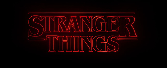
Netflix's Stranger Things firmly displays its retro intentions by using International Typeface Corporation’s Benguiat, a face by Ed Benguiat that was released in 1978. Although obviously inspired by Art Nouveau typography, Benguiat was very much a product of its time and of ITC, with its typically large x-height (the height of a lowercase “x” when compared to a capital) and the bold contrast between thick and thin strokes.
 |
| ITC Benguiat Bold (1978) |
It’s informative to look at Benguiat in comparison with a well-known Art Nouveau typeface, Desdemona (1886), from which it cribs a few features, including the upward slanting bowls of the P and the R; the high beams of the E, F, and H; and how the slanted beam of the N connects two-thirds of the way down the right stem. But true Nouveau fonts would never have the extreme stroke variation of Benguiat, as they drew their inspiration from vegetal forms.
 |
| Desdemona Black (1886) |
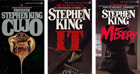
The bold readability of Benguiat and its wiff of nostalgia made it a particular favorite for paperback designers of the early-to-mid 1980s, where it displaced fussier, swash-serifed and flourish-heavy faces like Tiffany (1974) (also designed by Ed Benguiat). The simple, wedge serifs were well-suited to embossed titles, which were becoming the vogue, especially for genre fiction such as romance, sci-fi, and horror. Bespoke hand-drawn adaptations of the face eventually became the standard setting for Stephen King's name in Signet paperback editions and it's these books that the producers of Stranger Things specifically want to evoke.
 |
| Signet King paperbacks showing letterform variation |
While researching Benguiat I was struck by the variation I found in the treatment of King’s name on paperback covers. Before desktop publishing, there was no simple way to manipulate letterforms and designers had to draft logos by hand, particularly if they wanted the letter block set close or to add a flair to a serif or swash. This meant long hours with a set of French curves, and I can actually remember as a baby designer back in the late 80s designing some titles this way. I doubt I still could.
Typefaces by Ed Benguiat
Benguiat had a long career at ITC and was responsible for many of its signature faces.
Horror Books of the 1980s
This collection by Will Erikson shows how ubiquitous Benguiat was (Thanks to Phil Gonzales for the link).
Another blog entry about the same thing
After I wrote this I was pointed to this essay by Ryan Britt on Inverse.
Benguiat is also the typeface for the Smiths' Strangeways Here We Come.

